Math 5421 Spring 2025
Introduction to Climate Models
Assignment 2
due January 28
Atmospheric Carbon Dioxide
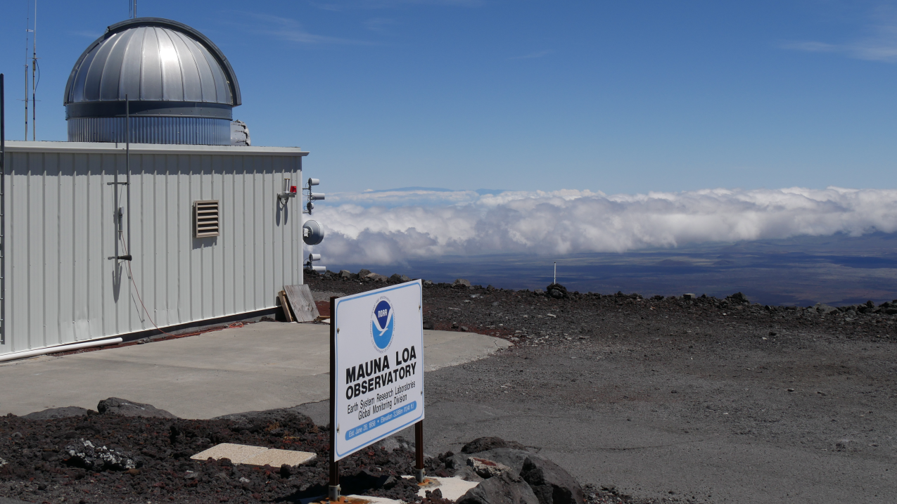 The atmospheric carbon dioxide concentration has been continuously monitored by the Scripps Institution of Oceanography since March of 1958. The concentration is measured in parts per million (ppm), which is the number of carbon dioxide molecules in one million molecules of air. The measurements are taken at an observatory on the top of the Mauna Loa volcano on the big island of Hawaii. The location was chosen because the prevailing winds are westerly and air has traveled across half of the Pacific Ocean where there is essentially no industrial activity to contaminate the samples.
The data from the Mauna Loa observatory are available to the public and can be downloaded by following the link on this page:
https://scrippsco2.ucsd.edu/data/atmospheric_co2/primary_mlo_co2_record.html
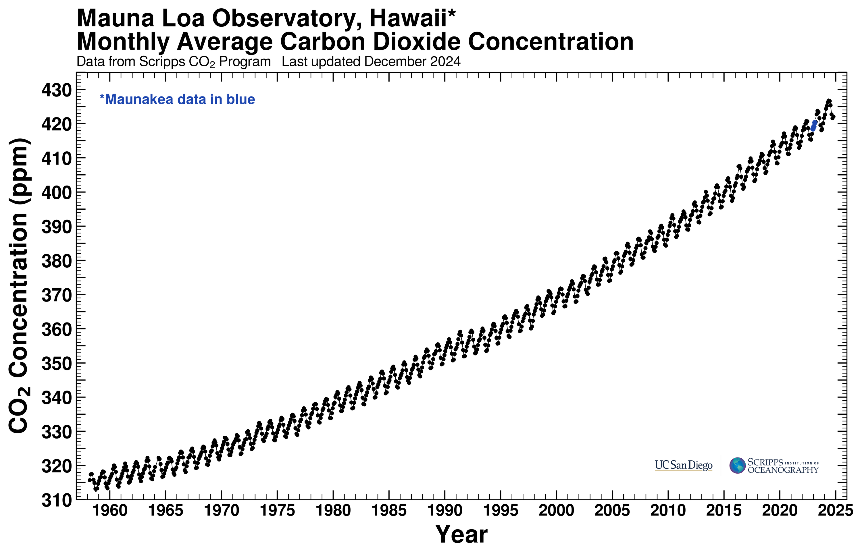 The page also displays a graph of the atmospheric CO2 concentration as a function of time, shown here on the left. Note that the graph contains two components, a oscillatory seasonal variation superimposed on an increasing curve. We see that the atmospheric CO2 concentration has increased by over 100 parts per million since 1958. The oscillatory variation is a result of biological activity. Since the Mauna Loa observatory is in the Northern hemisphere, the decreasing CO2 concentration occurs in the summer months when photosynthesis by plant life is most active, pulling CO2 out of the atmosphere and converting it to biomass. The increasing CO2 occurs during the winter months when respiration by plants and animals outweighs photosynthesis, consuming organic material and turning it back into CO2.
I have simplified the file downloaded from the Mauna Loa site to include only the monthly values for the atmospheric concentration of CO2 (ppm) and have posted the simplified file here:
https://www-users.cse.umn.edu/~mcgehee/Course/Math5421/data/MaunaLoaCO2.csv
As before, the first three columns contain the year, month, and date, while the fourth column contains atmospheric CO2 concentration in ppm.
Exercise 1
Download the data from the link given above and produce a graph of the monthly atmospheric CO2 concentration for the years 1958 to 2025. Include the linear trend line and extend it so that you can see the answers to the following questions.
(a) In what year to you expect the atmospheric CO2 to reach 430 ppm?
(b) Same question for 500 ppm.
Make a new graph of the same data, but this time include a trend line using a quadratic trend.
(c) In what year to you expect the atmospheric CO2 to reach 430 ppm?
(d) Same question for 500 ppm.
(e) Discuss the differences between using a linear trend versus a quadratic trend. Which do you think makes a more accurate prediction and why do you think that?
Exercise 2
Using the data that you downloaded for Execise 1, make a graph just for the twenty-first century. (Don't just change the horizontal axis. Restrict the data for the graph to only data from 2000 to 2024.) Make one graph with a linear trend and make another with a quadratic trend.
(a) If you assume the linear trend continues, in what year to you expect the atmospheric CO2 to reach 230 ppm?
(b) Same question for 500 ppm.
(c) Same as (a) and (b), but assume that the quadratic trend continues.
(d) Do you think it is better to use all the data from 1958 to 2024 or to restrict attention just to the twenty-first century? Why?
Global Mean Temperature vs Atmospheric CO2
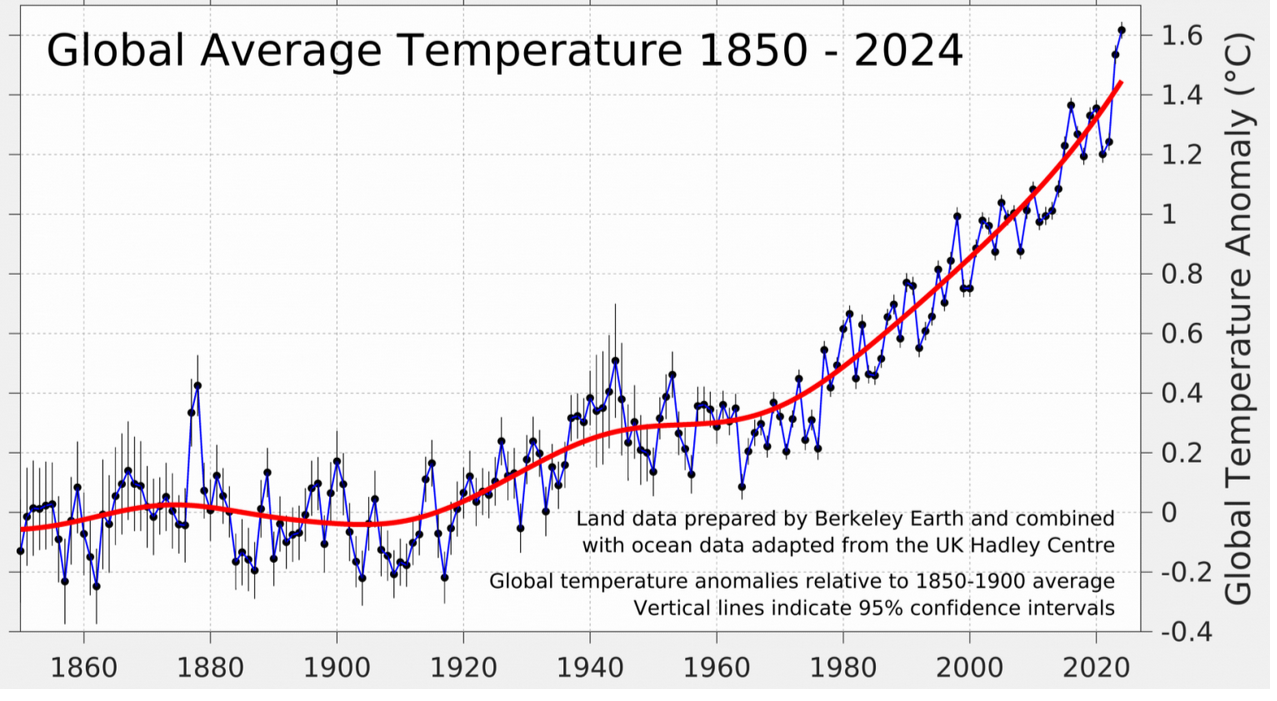 Recall the global mean temperatures shown in the data from Berkeley Earth, shown on the right. Comparing this with the Mauna Loa data, we see that both the global mean temperature and the atmospheric CO2 levels are increasing. There is a theory dating back 200 years explaining the greenhouse gas effect: the Earth's surface temperature increases if the atmospheric CO2 increases.
Next we examine the correlation between temperature and CO2.
I have combined the two data sets into a single file and posted it at
https://www-users.cse.umn.edu/~mcgehee/Course/Math5421/data/GMTvsCO2_21.csv
The first three columns are as before: year, month, and fractional date. The fourth column is the atmospheric CO2, in ppm, while the fifth column is the global mean temperature anomaly.
Exercise 3
Download the data from the link given above and produce a graph of the global mean temperature versus the atmospheric CO2 concentration. Put the CO2 in parts per million on the horizontal axis and the global mean temperature anomaly on the vertical axis. For the chart type, choose "scatter chart" instead of "line chart." Include the linear trendline and extend it so that you can see the answers to the following questions.
(a) At what atmospheric concentration do you expect the temperature anomaly to reach 1.5°C?
(b) Same question for 2.0°C.
Make a new graph, but this time use a quadratic trend.
(c) Answer questions (a) and (b) for the new graph.
(d) Which trend to you think can more accurately predict the future? Why?
(e) Discuss cause and effect. Do you think that the increasing CO2 is causing the rising temperatures, or do you think that the increasing temperatures are causing the increasing CO2?
Instructions for all Three Exercises
Transfer your graphs to a Google Docs document. Locate the answers to your questions near the corresponding graph. Share your document with mcgehee@umn.edu.